Logo Design
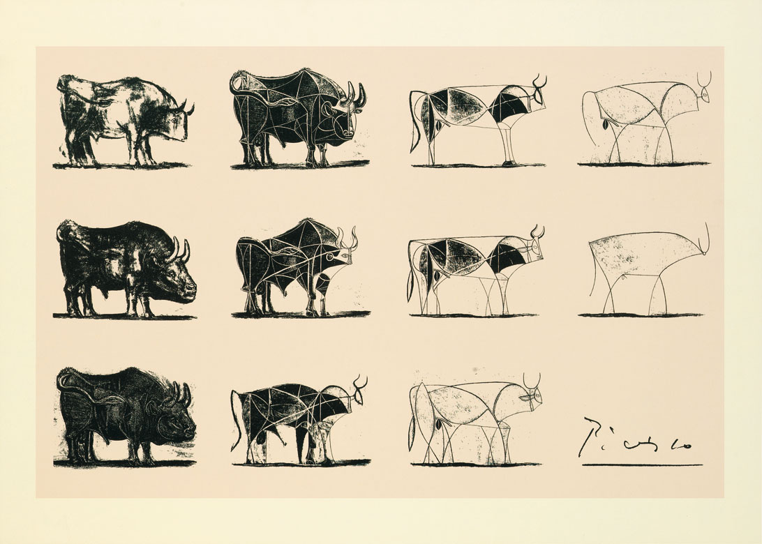
‘Bull’ is a suite of eleven lithographs that have become a master class in how to develop an artwork from the academic to the abstract. In this series of images, all pulled from a single stone, Picasso visually dissects the image of a bull to discover its essential presence through a progressive analysis of its form. Each plate is a successive stage in an investigation to find the absolute ‘spirit’ of the beast.
– John MacTaggart, from Pablo Picasso — Bull: a master class in abstraction
A logo is a graphic mark that is used to identify a company, organization or individual and by extension it’s brand. Developing a unique logo involves iteration and simplification similar to what Picasso did with his bull series. Apple’s internal training program used these same drawings as an example of how to think about refining a product. For this project, you will learn how to distill a complex image into a logo and to simplify through addition and subtraction a word into wordmark or logotype.
Step One
Using the animal you created in your Creature Synthesis project as a starting point, create at least 3 sets of drawings that attempt to capture the ‘spirit’ of the form. You do not have to use the exact image you created, but should be thinking about a Platonian archetype, that is to say “what makes a ‘thing’ a thing”.
For example, what makes a shark unlike other fish? Is it the black eye centered in the triangular slab of it’s head? Or, is the the vertical gill slits in an aerodynamic body? For this assignment, one set of drawings may work towards the black eye archetype, while another focuses on the gills or body shape.
This series of drawings is not so much about leaping towards a final design, but this is an exercise in learning to simplify and evaluate forms while retaining the ‘spirit’ of the original subject. How you decide to simplify is unique to your experience and your tastes.
Evaluate each drawing and make choices that captures the ‘spirit’ of the two animals you combined in the Creature Synthesis collage.
Format: each series of drawings is to be on an 8 1/2 X 11 vertically oriented sheet of paper, with a grid of small drawings 3 across and 3 down for a total of 9 drawings.
No drawing should be larger than 2″ X 2″ and the drawings should show a progression of simplification and examination of the form. Do not put your drawings in a box, they should float in order to evaluate the silhouette and have a comfortable amount of space between each drawing. They need to be all on the same page in order to compare various ideas.
In the form of a PDF turned in on Canvas, turn in 3 sheets demonstrating different ways of simplifying your creature to best capture it’s ‘spirit’ with the least amount of detail. You will have a minimum of 27 drawings.
Step Two
Based on your drawings, pick one or two that you would like to refine into a logo. Using the identical format above, create a single page with 9 options for your final logo. On Canvas turn in this page AND bring in a printed copy to class for critique.
Step Three
Based on the feedback you have received, place your final and refined sketched into Illustrator and turn the drawing into a finished logo. A key requirement is the logo must be only black, with no color or white. This allows the logo to be placed on a background and have the background show through. Typically you will need to use compound paths, cutting or the exclude filter to produce a final logo.
Center your logo on a vertical 8 1/2 X 11 page so that it is large, and sits well on the page. Upload your finished logo to Canvas AND print out for critique in class.

