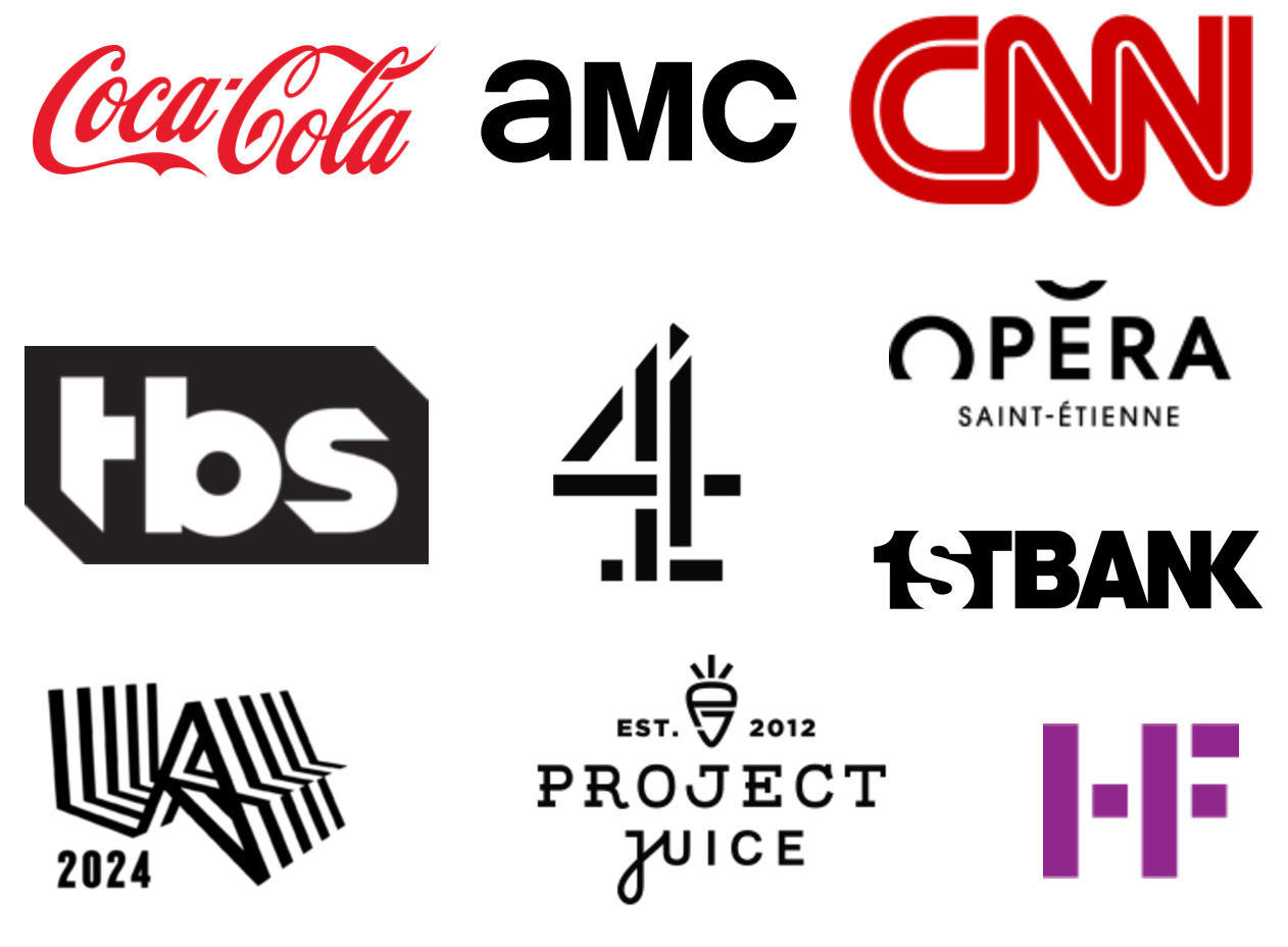
Logotype

A logotype or wordmark is a series of letters that are tightly integrated to form a unique mark that represents a company, organization or individual. Sometimes a company will forego the use of a pictorial logo and have only a wordmark while it is more common to have both. In our case this word mark will be associated with the logo that you created in Exercise 3.
Often, if not always, a logotype starts off with an existing font and through additions and subtractions a unique mark is derived. Jared Jacob of Sunday Lounge Design has a beautiful example of this in his poster for Salida’s Winefest and in many other works on his site. Notice how the url at the bottom is a similar font to the logotype he has created:

Step One
In Adobe Illustrator, type the name of your logotype on an 8 1/2 X 11 vertical sheet of paper, setting the font size to 48pt and using only black. Duplicate this ten times to fill your page vertically and create 10 unique versions of your name using various fonts, tracking and weights. Do not alter your letterforms at this stage, focus on font choices and iterations of the name. Experiment with all lower case, all upper case, mixtures of upper and lower.
Notice how the designers of ‘aMc’ and ‘jUICE’ above used changing upper and lower case to help create a unique mark? Can you see that ‘Opera’ is using small caps? Experiment and pay attention to the overall shape of your word when you play with different fonts and cases. Look at Steps 1 & 2 of this logotype how-to page.
Duplicate this page 2 more times and generate even more variations. Print out 3 sheets and bring them to class for critique.
Step Two
Pick one or more from the experiments above and produce 6 pages of experiments with your word using only black and white (no grey or colors yet). You will need to ‘expand’ your word to outline mode and it usually helps to ‘ungroup’ them as well. Produce at least 5 variations of your word on each page and label the page accordingly.
- Subtract as many lines and edges as you can while still maintaining the readability of your word. Join and re-connect shapes as needed to make clean forms, but do not add or alter the letterforms
- Create an alternate version of one or two letterforms. Try to stay true to the spirit of the font, but also make it uniquely original and an obvious change
- Create a dimensional version of your word by suggesting depth. Consider duplicating the word, or suggesting lighting through strategic fills and negative space
- Explore the use of positive and negative space while still maintaining readability. Can the counter of an ‘o’ for example, still read as an o?
- Freely transform your word in different ways, nothing is off limits and consider experimenting with filters (vector only) to produce interesting variations
- Pick your 5 favorite variations from above and ‘reverse out’ the type on a background shape. You may need to use the Exclude tool or make your path a Compound path to do this
You will end up with a page titled ‘Subtraction’ that shows 5 variations using subtraction, and another 5 for ‘Alteration’, etc. until you have 6 pages of experiments, with 5 on each page. Print these 6 pages out for critique. You will have a total of 30 experiments with your word.
Step Three
Based on all of your experiments, combine your wordmark with the logo you created in Exercise 3. Make adjustments so that the two work together as a unified identity mark. The logo and logotype should share a ‘shape language’, meaning similar use of curves, angles and thickness of lines so that they deliver a single message when used together.
Step Four
Design a single 8 1/2 X 11 page that shows various ways that the logo can be used. This is known as a ‘logo usage’ page and is part of a companies branding guidelines, a simple example online is the WhatsApp branding guidelines but there are many more examples if you Google Branding Guide or Logo Guidelines. You do not have to specify size, dimensions, just give basic examples of how you intend for your mark to appear.
The following elements are required to be on your page:
- The logo used by itself in B&W with no gradations
- The logo used with the logotype in B&W with no gradations
- Examples when used on a background color
- Examples using color for the logo/logotype combination
Compose your page in a clear, clean and concise manner that shows off your logo design and how it looks when printed.
Step Five
Create a 3 page document that includes:
- A cover page that is your logo alone
- A process page that shows your favorite wordmark experiments
- The logo usage page from step 4
Upload as a .pdf to Canvas and print out for critique in class.
Video Tutorials
